responsive
-
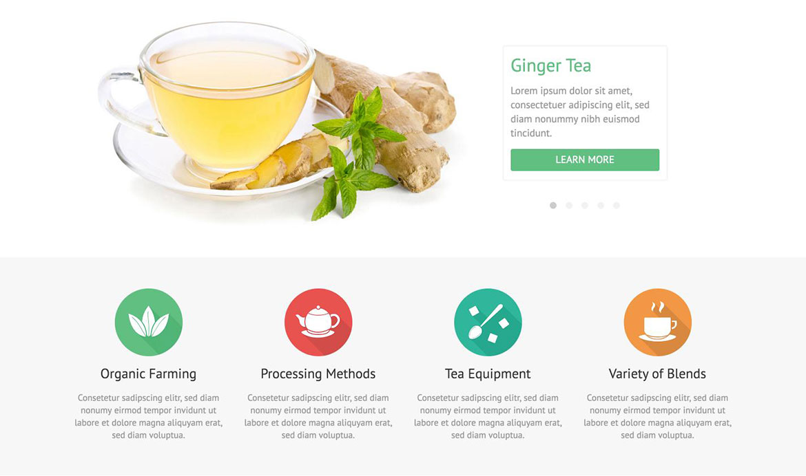
Hot Tea - Elegant Template
So simple and so beautifully elegant template.

Hot Tea is an elegant and responsive Joomla template focused on tea as one of the most popular beverages on the planet.It's not crowded with graphic and its light design with one accent color may be appropriate for many different kinds of websites, not only those related to production of tea.
By default, this template has one column. However, as we presented on our demo, it's possible to publish modules on left and right columns if needed. This template comes with many new features that we added in our framework.
- Responsive template, based on clean HTML5/CSS3 code, and powered by Sparky Framework for Joomla.
- CSS3 and jQuery based animations welcomes visitors of your site.
- 4 pre-defined color styles. All colors are easily customisable from the Sparky options (infinite color options).
- Customisation of the template's layout and adding/removing module positions is easy. It's powered by Sparky's drag and drop Layout Editor. Change layout and element's dimensions easily whenever you need.
- We included several responsive Joomla modules with this template. Hot Swipe Carousel (retina ready), Hot Slicebox, Hot Responsive Lightbox, Hot Maps and Rapid Contact module. All these modules are included with this template without additional fees (you save $15 per commercial module).
- Retina ready images in articles, custom modules and carousel. Full support for modern screens with double pixel density.
- HotStart (SQL dump) available with both single purchase or any membership plan. It copies template with all extensions and demo pages easily.
- Unlimited number of module positions can be added easily within Layout Editor of Sparky Framework, if needed.
- PSD source file and fonts are included.
- Total control of all menus through the framework. You can set functionalities and style of all your menus and drop them directly into the layout. Off-canvas top menu with drop-down sub-levels is included as default menu. The top menu is converted to a button for easier navigation on the mobile devices.
- This template has been tested with Chrome, Edge, Firefox, IE9+, Opera and Safari browsers on PC and Mac computers. It's also tested on iOS and Android mobile devices.
- Support for RTL (right-to-left) languages.
 Sylvia Serbezovski
 Ryan Borowitz
 Elisabeth Lopez